
Designing for Dual Screen and Foldable Devices With CSS
Published on
11 May 2023
With the announcement of Google's Pixel Fold, I thought its an apt time to revisit what technologies are available for designing and developing experiences that adapt to a foldable device.
Let's ignore the naysayers who vehemently don't want to design for a new form factor, while also ignoring the price of Goggle's first generation device and just focus on what's possible right now.
CSS Media Queries for Viewport Segments #
There are two media queries for targeting your foldable device.
@media (horizontal-viewport-segments: <count>) { }
@media (vertical-viewport-segments: <count>) { }
The horizontal-viewport-segments query targets the device when it is being held like a book and the two screens are side-by-side.
And vertical-viewport-segments targets the device when the two screens are stacked on top of each other and fold like a laptop. I've found this mode useful when using my Surface Duo with PowerPoint. I can access my speaker notes on the bottom screen and my presentation is on the top screen. Pretty snazzy.
CSS Environment Variables #
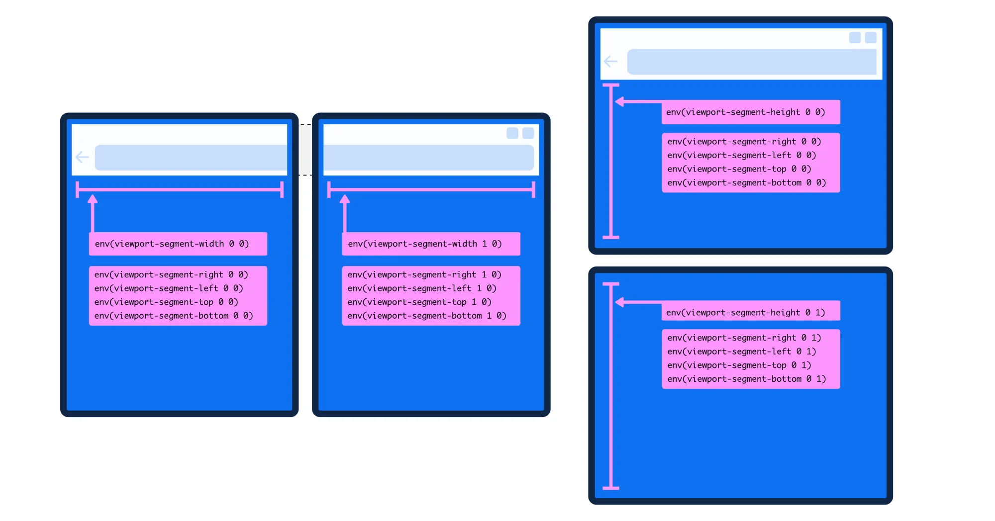
In order to get the geometry of each display, a handful of environment variables have been created for dual screen devices.
env(viewport-segment-width <x> <y>);
env(viewport-segment-height <x> <y>);
env(viewport-segment-top <x> <y>);
env(viewport-segment-left <x> <y>);
env(viewport-segment-bottom <x> <y>);
env(viewport-segment-right <x> <y>);
The x and y positions represent the two-dimensional grid created by hardware features that separate each viewport segment, with the coordinates 0,0 starting at the top-left segment.
 ]
]
Environment variables are cool because they will calculate dimensions by the device and make the adjustments for you meaning you don't have to create designs for every unique device out there. There are a number of foldable devices already and they all have different screen and hinge dimensions.
This set of environment variables also lets you place and position content across the two screens.
In my demo, I've built a recipe page that changes to a two column layout when on a dual screen device. I'm using CSS Grid and I can use the environment variables as grid column or row values.
@media (horizontal-viewport-segments: 2) {

    .container {
        grid-template-columns: env(viewport-segment-width 0 0), 1fr;
    }

}
This line of code means that the first grid column will take up the entirety of left display when the device is held in the vertical position (like a book), and the second grid column will take up the remaining width of the display space available, which is the display on the right.
If you wanted to be more explicit, you could write:
@media (horizontal-viewport-segments: 2) {

    .container {
        grid-template-columns: env(viewport-segment-width 0 0) env(viewport-segment-width: 1 0);
    }

}
Again, this means that each column takes up a display. Pretty sweet.
When should you include a dual screen mode in your product? #
Back to the naysayers. When I first started talking about dual screen design, so many people reacted negatively. And honestly, no one is forcing you to create a website or app that adapts when it's spanned across two displays.
With the Surface Duo, you can utilize the browser in one display pane and it displays like a normal responsive website. Not every site or app does need a dual screen mode, but its best to find out what kind of devices your customers are using and whether or not a dual screen mode is worth the investment. As always, use data to guide your decisions.
The forecast for foldables shipped in 2023 is expected to be above 21 million devices (source). Compared to the mobile device market, its just a sliver, but that's still millions of foldables being used out there.
The other reason I'd create an app or website that adapts for a foldable device? If I wanted to stand out.
The Pixel Fold reinforces that foldables are here to stay, so why not delight your users?
Browser Support #
The media queries and environment variables are currently supported in Microsoft Edge Stable.
Unfortunately, Chrome Stable doesn't appear to have the same support yet which seems like a huge miss for the Pixel Fold & Chrome teams. You can enable the experimental web platform flag under chrome://flags and test in Chrome with the Surface Duo emulator.
Closing #
This article is just an overview and reminder that these capabilities exist for foldable web and app experiences. The space is ripe for innovation in design and layout on the web (and for native apps) as new foldable devices ship, but without the browser and OS support, companies won't be able to get devs and designers to take building foldable experiences seriously.
If your'e still interested exploring what's possible with dual screen layouts, I've a much more in depth article over on Smashing Magazine that walks through the recipe demo I made for the web. So download Microsoft Edge and happy building.