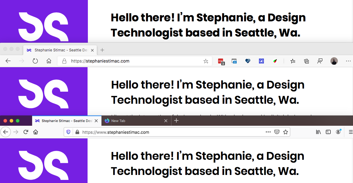
Browser font rendering inconsistencies
22 June 2020
I was working on a project that required me pulling up the developer tools in different browsers against my personal website when I opened up Safari and noticed how drastically different the title of my page was rendering. It was extremely bold in Safari compared to the other browsers.
Much more bold than I expected it to be.

I looked at my stylesheet and saw that I had applied minimal styling to my headings and recall a decision to just let the browser handle the heading styles apart from defining the font-family and font-sizes. So the difference in weight was be caused by the browser.
h1 tags are bold by default but there appears to be extra bold being applied by Safari.
Jason Pamental suggested using font-synthesis: none; but that didn't have any effect in Safari or Firefox (it's not supported in other browsers at the moment.)
Computed Styles #
I started to dissect differences between the user agent style sheet and the Computed Styles tab in the DevTools.
Safari User agent stylesheet:
h1 {
  font-weight: bold;
}
Safari computed CSS properties
h1 {
  font-weight: bold;
}
Edge, Chrome and Firefox user agent stylesheet:
h1 {
  font-weight: bold;
}
Edge, Chrome and Firefox computed CSS properties
h1 {
  font-weight: 700;
}
In the computed tab, Edge, Chrome and Firefox are all showing font-weight: bold to be computed to a font-weight of 700, whereas Safari's computed font-weight doesn't have a numerical value, it just remains computed as "bold." But this still doesn't explain much.
In fact somewhat ironically, Safari doesn't have font-weight: 700 defined anywhere in stylesheets that I can see in the DevTools but it is rendering h1s in the 700 font-weight for the typeface Poppins.
Browser fallback behavior #
So now I'm even more baffled and look to the line of code I have to define the font and font-weights I'm using.
<link href="https://fonts.googleapis.com/css?family=Poppins:400,600" rel="stylesheet">
I don't know why, but I'm compelled to delete "600" from the string while in Edge. So I do and suddenly watch as the heading in Edge re-renders at "400".
Wait.
I add ,700 to the end of this string: Poppins:400,600. My heading re-renders and now matches Safari. I remove ,700 and it re-renders in the 600 font-weight. I delete 600 again, it re-renders in the 400 font-weight.
I test this in Firefox and see the same results.
Edge, Chrome and Firefox all have a computed font-weight of 700 and if that particular font-weight isn't defined in the line of Google Fonts code, the browser grabs the next highest numerical font-weight that is defined and renders that font-weight as the bold weight. If you delete all font-weights from the Google Font code, you get the thinnest version of the font.
So what happens when I test this in Safari? Absolutely nothing. It doesn't matter if I delete all the font-weights from the font link. Safari's headings remain bold. But then I noticed something interesting as well after deleting the 400,600 from the font code...my nav bar on my website didn't change either in Safari.
So to confirm I was in fact seeing what I was seeing I changed the file on my live site and stripped 400,600 out so all I had was the following:
<link href="https://fonts.googleapis.com/css?family=Poppins" rel="stylesheet">

And Safari didn't change at all. I still had the CSS for my nav links declaring them at font-weight: 600 and Safari was still pulling that weight despite me not defining it in the font code.
Edge, Chrome and Firefox had all fallen back to the thinnest font available.
So what do I do to render headings consistently across browsers and platforms? #
This almost feels like a loaded question. This problem is almost akin (but a little bit less complex) to rendering HTML Forms consistently across platforms and browsers. The cross-platform problem is a harder one to solve as you can't control how the operating system handles font rendering.
If you don't want the browser to decide how to bold font-weights then I suggest explicitly defining the font-weight with numerical values: 500, 600, etc to avoid Firefox, Edge and Chrome falling back to whatever the highest font-weight defined is.
And a bit of a disclaimer: I've only looked at h1 rendering for this article. I suspect there are many other areas one could dive into to compare other headings and paragraph rendering.
And the final question you may be wondering is this:
Which way is actually right? Firefox/Edge/Chrome or Safari?
And my answer is: I don't actually know.
Multiple browsers behaving the same isn't necessarily indicative of the correct implementation so I suspect I will be trying to dive into browser behavior to figure out the correct implementation at a later date.
