Building my bullet journal layout with CSS Grid & Subgrid & Flexbox
Published on
29 Dec 2019
This is a post about how I built my bullet journal demo that you can find over here.
My bullet journal layout is pretty simple compared to some of the more elaborate, colorful and playful layouts I’ve seen. I mainly use my bullet journal to track a few monthly goals, bills, my weekly tasks and my schedule.
My work calendar can become full of non-blocking “Office Hours” and tech talks that I may or may not have time to go to. Basically: digital calendar clutter can muddy my view of the week, and, perhaps it’s the designer in me, I prefer to keep some sort of hand written view of my week. (And also practice my hand-lettering. Like I said: designer.)
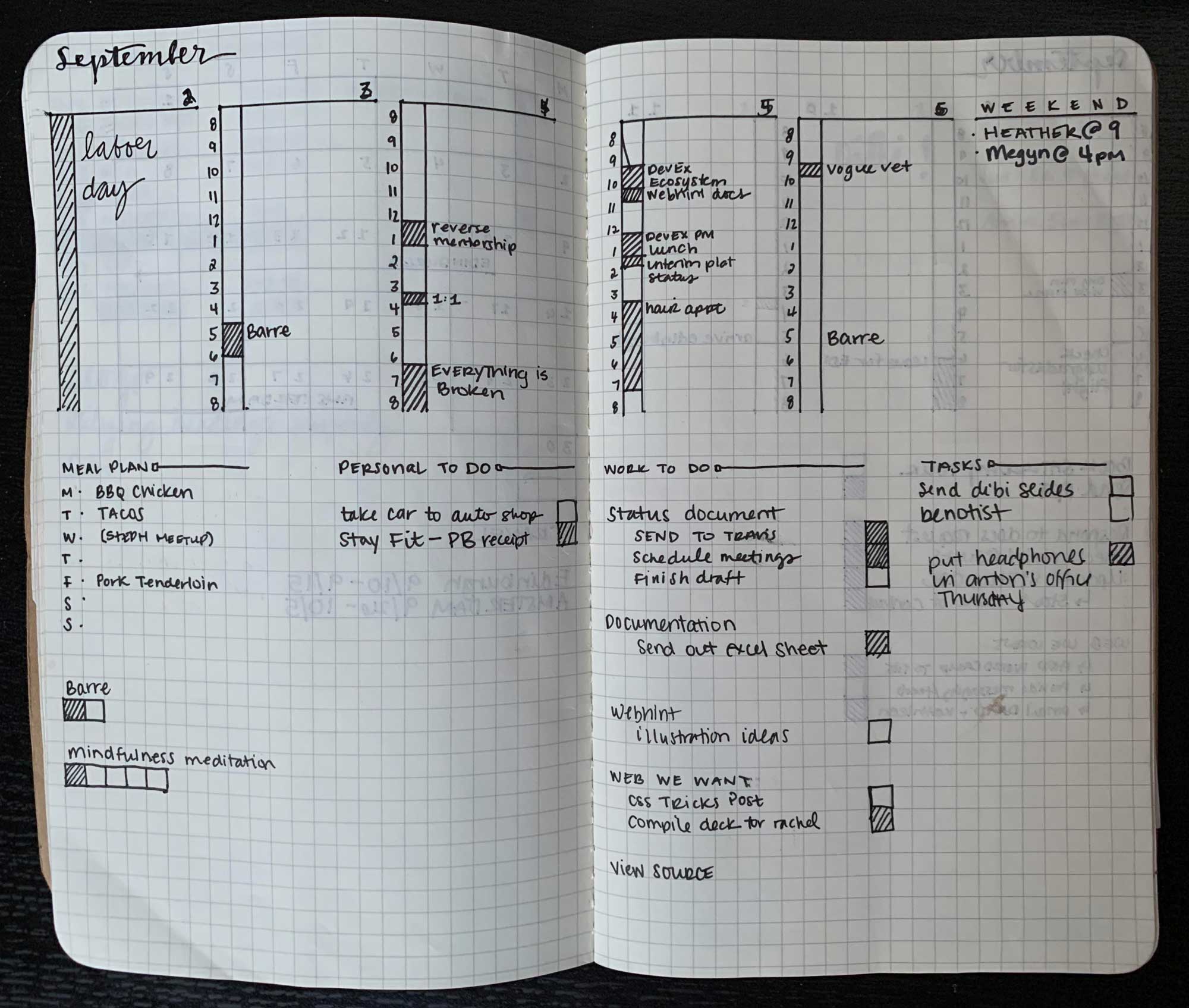
Here is what my actual bullet journal looks like, but the bottom half layout can vary as I usually track the bills due between the 1st and the 15th on the first weekly spread, and the bills due on the 16th and the end of the month on the third weekly spread.

This layout only has my meal plan section and weekly to-do. From the image above you can see that the layout varies below the daily time tables.
Defining the grid #
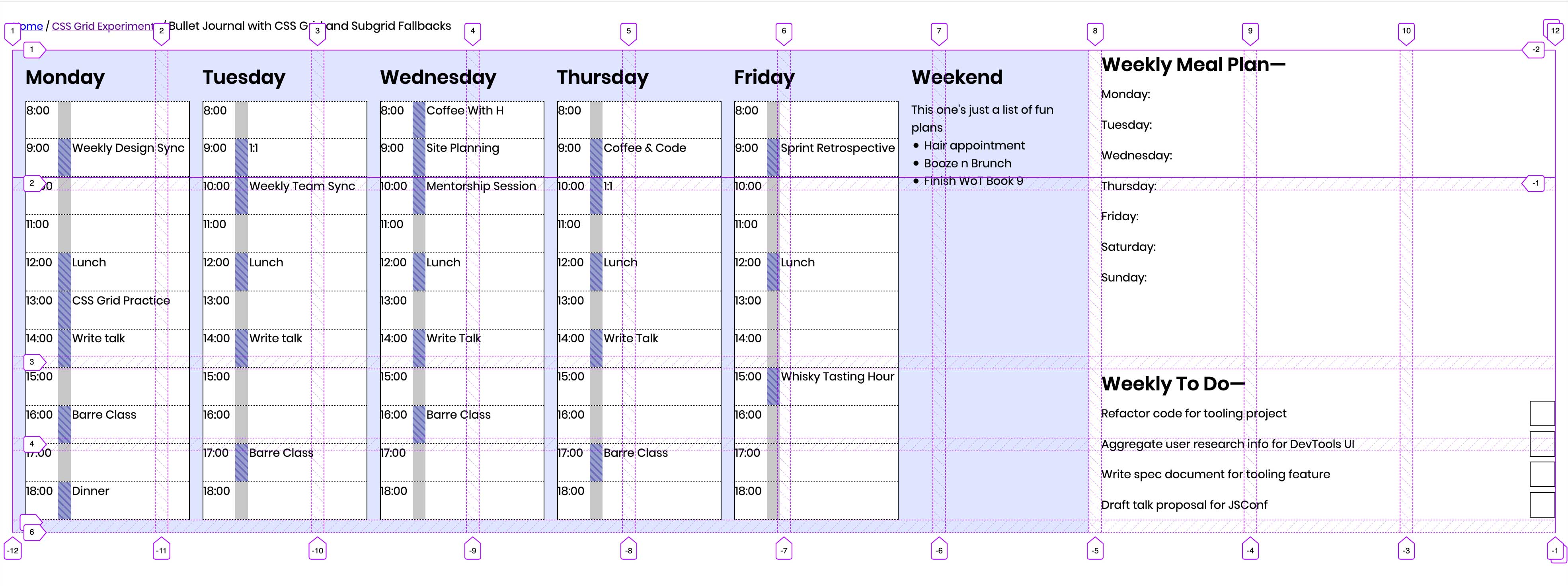
First, I defined the grid layout I wanted for the whole page. There was no real math behind this, I visually assessed and re-adjusted the grid based on the content I knew I’d be filling in and then went from there.
.grid-container {
    display: grid;
    grid-gap: 1rem;
    grid-template-columns: repeat(auto-fit, minmax(10rem, 1fr));
    grid-template-rows: repeat(auto-fit, minmax(5rem, 10rem));
}

For the columns, I wanted to be able to expand the entire layout to fit onto one row if the viewport width was large enough but still wrap cleanly onto new lines if the viewport was small, like on a phone screen. I used repeat and auto-fit to expand into any available space, and the columns are set to be a minimum of 10rem wide so that the timetables don’t get too narrow, and a max of 1fr so that columns are flexible.
To tackle the building the rest of the journal, I divided it into major sections:
- The “Day Grid”: the entire week
- The week layout grid will then breakdown into individual days and hours
- The meal plan
- My to-do list
A note on auto-fill vs. auto-fit #
There are lots of resources available on auto-fill vs. auto-fit. Sara Soueidan and Rachel Andrew have some useful write-ups already:
The Day Grid #
.day-grid {
    display: grid;
    grid-gap: 1rem;
    grid-template-columns: repeat(auto-fit, minmax(10rem, 1fr));
    grid-template-columns: subgrid;
    grid-column-start: 1;
    grid-column-end: 8;
    grid-row-start: 1;
    grid-row-end: 6;
}

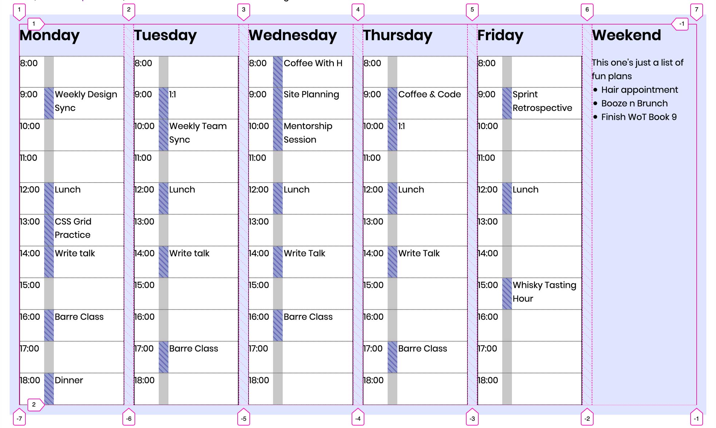
Here I define the grid for the daily timetable columns. I also want this to utilize CSS Grid and I want the columns to inherit their sizing from the parent grid, so I use subgrid. But subgrid isn’t supported in all browsers yet so I re-define the template columns from the parent grid. I define where I want the day grid to sit on the parent grid with grid-column-start, grid-column-end, grid-row-start, grid-row-end.
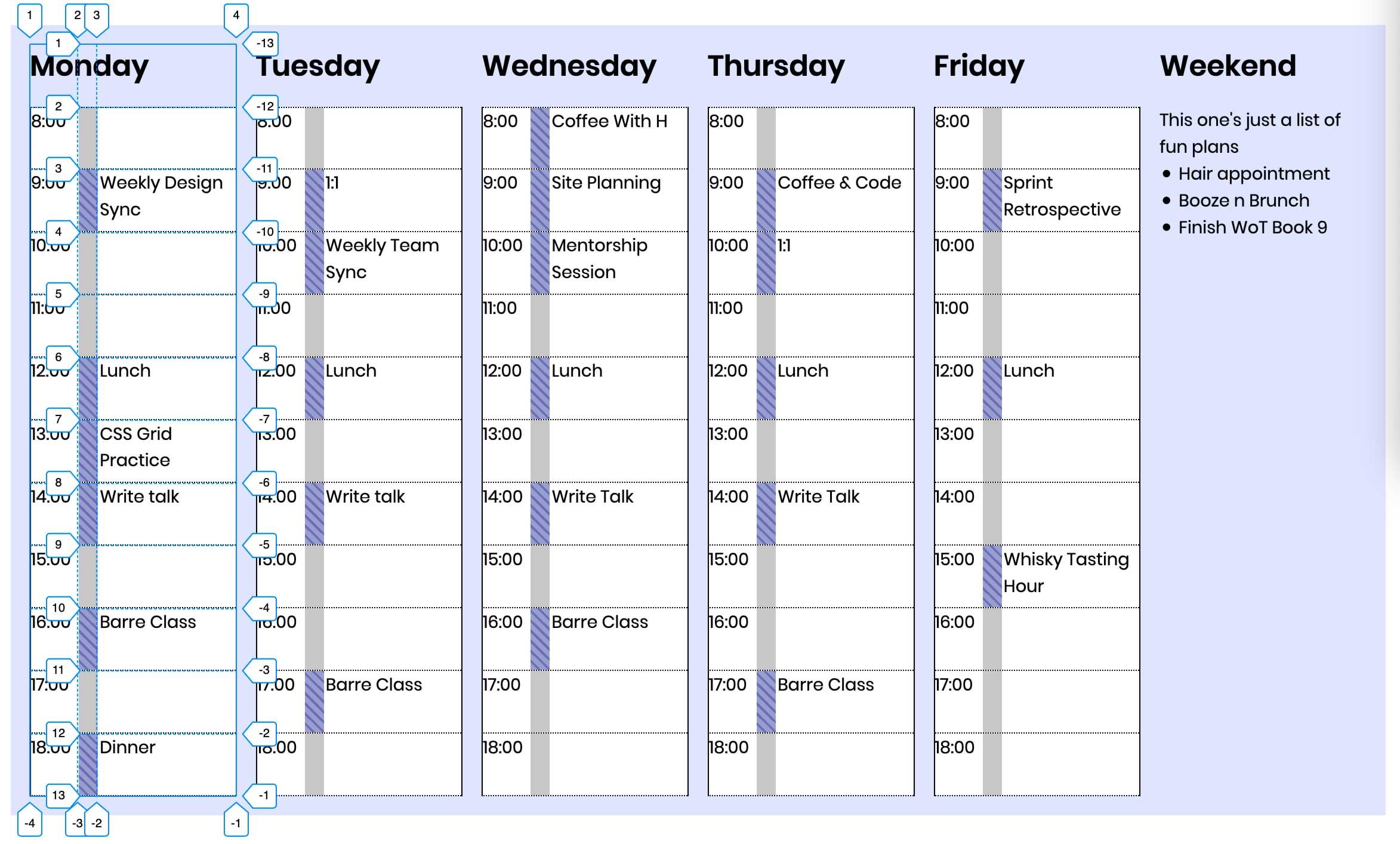
Now let’s dive into the individual column layout. Each day is defined as an <article> and I’ve defined a grid for each day column.
article {
    display: grid;
    grid-template-columns: 2.5rem 1rem 1fr;
    grid-template-rows: repeat(12, minmax(2rem, 1fr));
}

The columns are divided up into three sub-columns: the time, the busy block or the fill pattern to indicate a block, and the content container to write the activity for that time block. These columns are set at 2.5rem wide, 1rem wide, and 1fr to use up the remaining space since the content in the third column will vary in length.
Now onto the rows. I’ve divided my days up into 11-hour days because the bulk of my scheduled day happens between those times, but there are 12 rows defined because the day heading sits within the <article> grid. The height of the rows has a minimum of 2rem and a max of 1fr, again for flexibility.
Each row is representative of an hour (though in my actual bullet journal, each row is representative of a half hour), and I have the following code for the row:
.day-grid-hour {
    display: grid;
    grid-template-columns: 2.5rem 1rem 1fr;
    grid-template-columns: subgrid;
    grid-column: 1 / 4;
}

Once again, I want the columns to inherit the parent column template so I use subgrid and then re-define with the integers again for fallback purposes. I also define the column placement with grid-column: 1 / 4;. Each hour will start at grid line 1 and end at grid line 4. The row placement will be different for each hour though. I was trying to figure out if there was a way to get the rows to layout equally without having to define row start and end for each hour. If there is a way, please let me know on Twitter.
The meal plan & the to-do list #
Both of these sections are just placed on the grid with grid-column: span 2; and grid-row: span X;, indicating that columns and rows should span however many columns or rows.
I use display: flex; for the lists, though the meal plan has display: flex; applied to the container div and not the <ul>, whereas the weekly to-do is the opposite. I’m not sure why I did this, so I’ll poke around and make an edi/note to the post when I figure out why.
And then the weekly to-do list items each have display: flex; applied to them with justify-content: space-between; applied to align the checkboxes to the right and the text to the left. (Design note: ideally the checkboxes would be actual checkboxes, but I was more focused on the layout portion for this demo.)
Code for the to-do list items:
.to-do-container ul li {
    display: flex;
    justify-content: space-between;
    align-items: center;
    padding: .2rem 0;
}
Final Thoughts #
I want the biggest take away from this post to be about subgrid. Subgrid is incredibly powerful and will help improve building interesting layouts on the web. I can think of a number of instances where I want a layout to inherit the parent grid’s setup and subgrid will make that so much easier.
For now, use subgrid, and continue to provide the fallback values. This is something I took away from Miriam Suzanne’s talk at Smashing Conf NYC. There is no reason not to be using features that are only available in a limited number of browsers: just provide a fallback or progressively enhance. Hopefully, the more these experimental features get used in the wild, browser makers will take notice and start to implement.
So in 2020: keep using experimental features. Provide fallbacks. Build cool shit.
